props
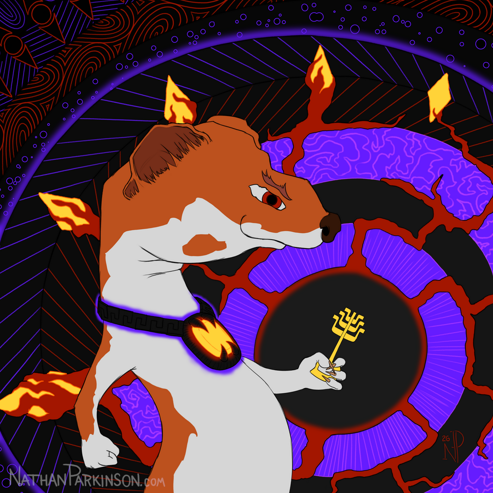
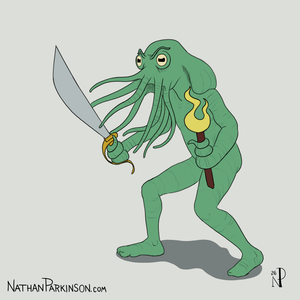
Key to Chaos
In this piece I tried to externalize what the evil weasel is thinking with the abstraction. There’s some interesting colour associations between the key, the gems, the extending tentacles, and the glow around the gem he’s wearing. The message: he’s got a taste of power, and he wants more.
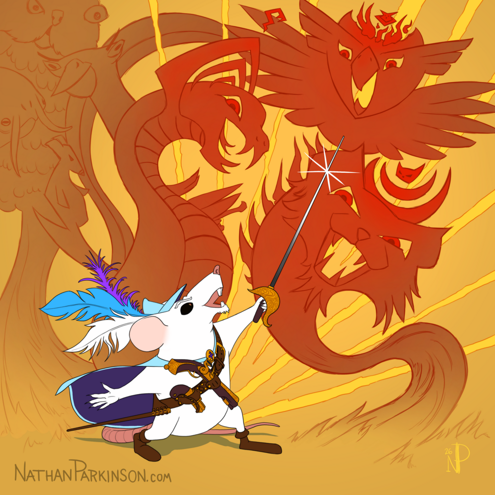
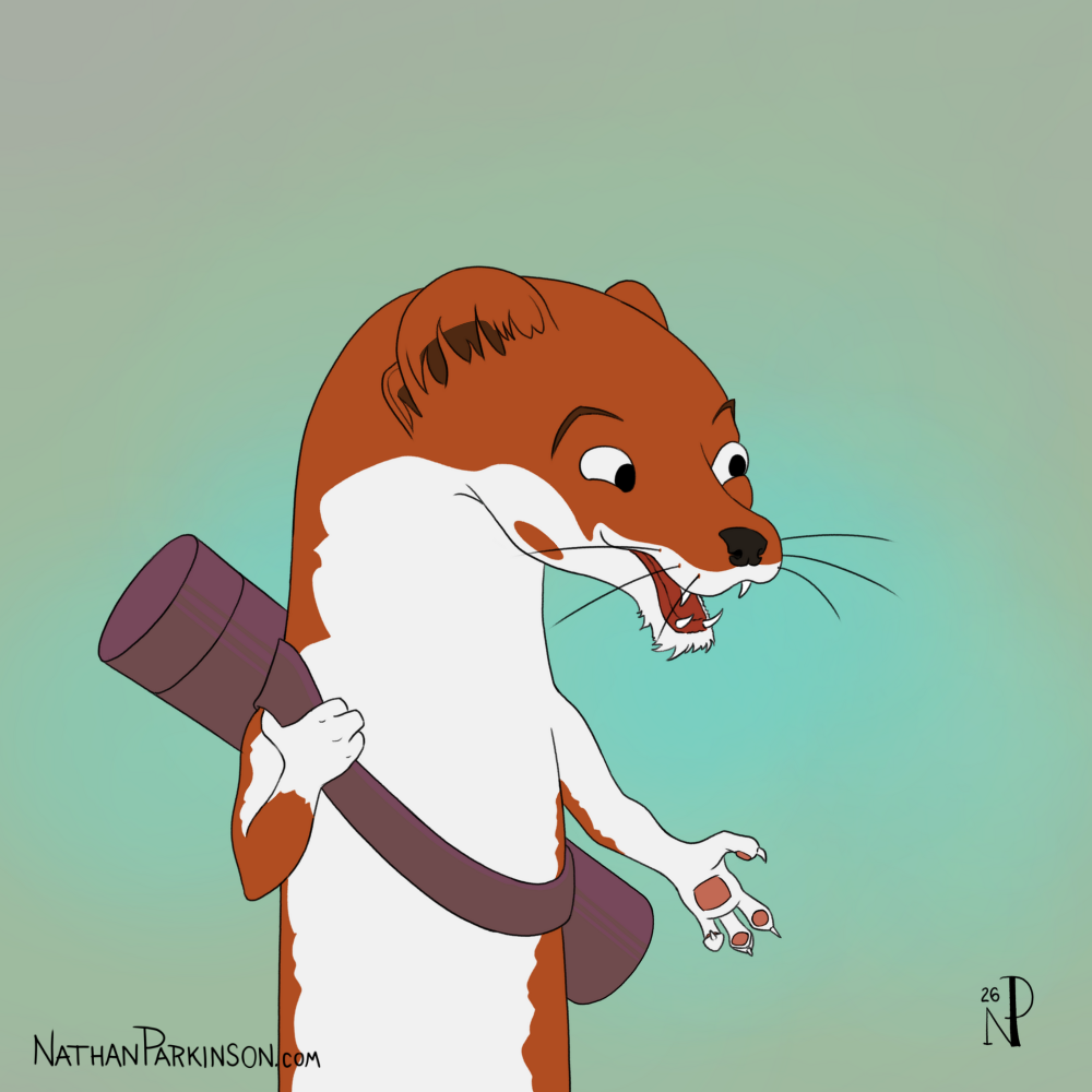
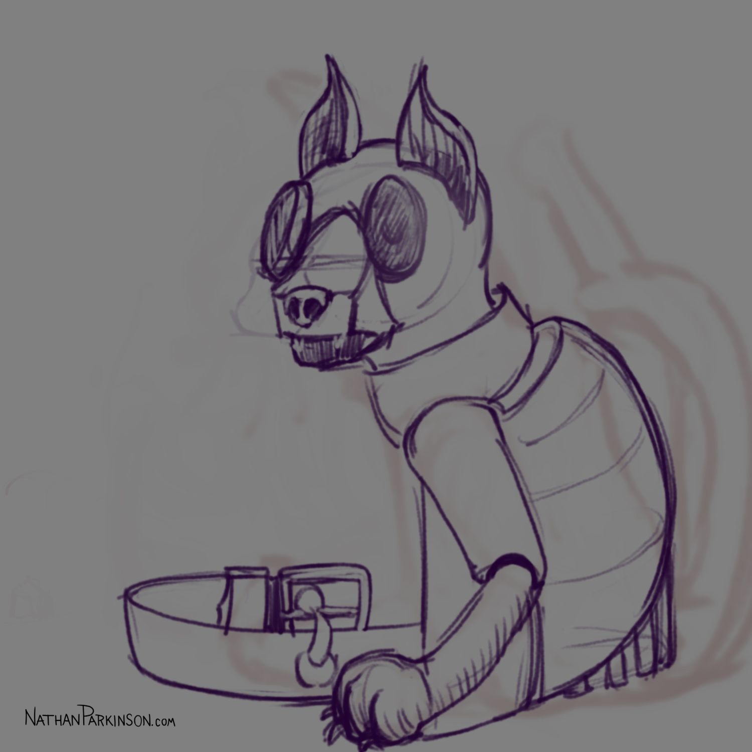
Mousketeer
Finished at last! This piece took a little over 20 hours across 3 weeks. I’m rather happy with the final result, though I intend for my next piece to be much simpler.
My goal with this piece was to utilize abstraction in the background in a more-intentional way; I believe I have accomplished that here; though I don’t feel I achieved quite what I’m aiming for, but I’m moving in the right direction.
I really enjoyed studying the weapons and how they connect to the baldric (shoulder belt).
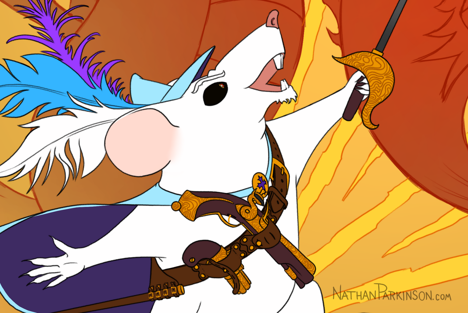
Here’s a close-up to show more detail.
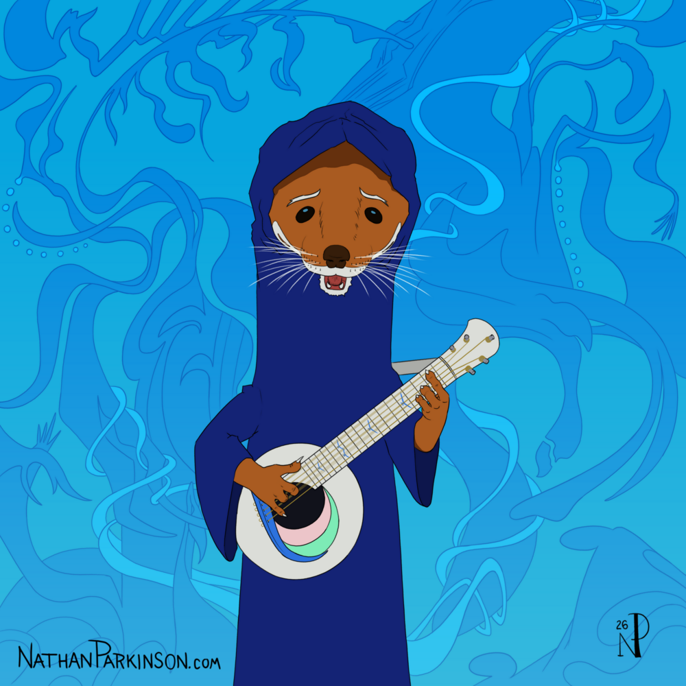
Blue Bard
First illustration I’ve completed in over a week. I am starting to add more complexity and work over multiple sittings.
I pulled back a bit from the purely abstract pursuit to something that is more-reliable for me, construction-based character illustrations. But once I had the rough composition done, I thought, well, maybe I could do some abstract stuff in the background. I’m pretty happy with the result.
I’d like to create the abstraction with maybe a bit more unifying intention about the theme of what the abstraction should be or perhaps story elements that I can weave into it. This was very much just whatever I drew, but in the future I want to find a way to hone that ability to direct the abstraction and integrate it into the story of the illustration more.


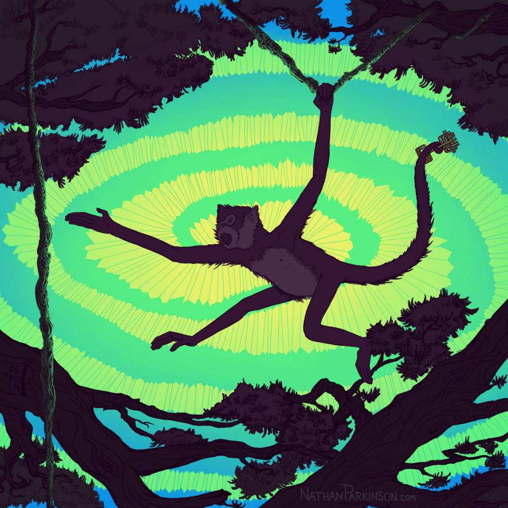
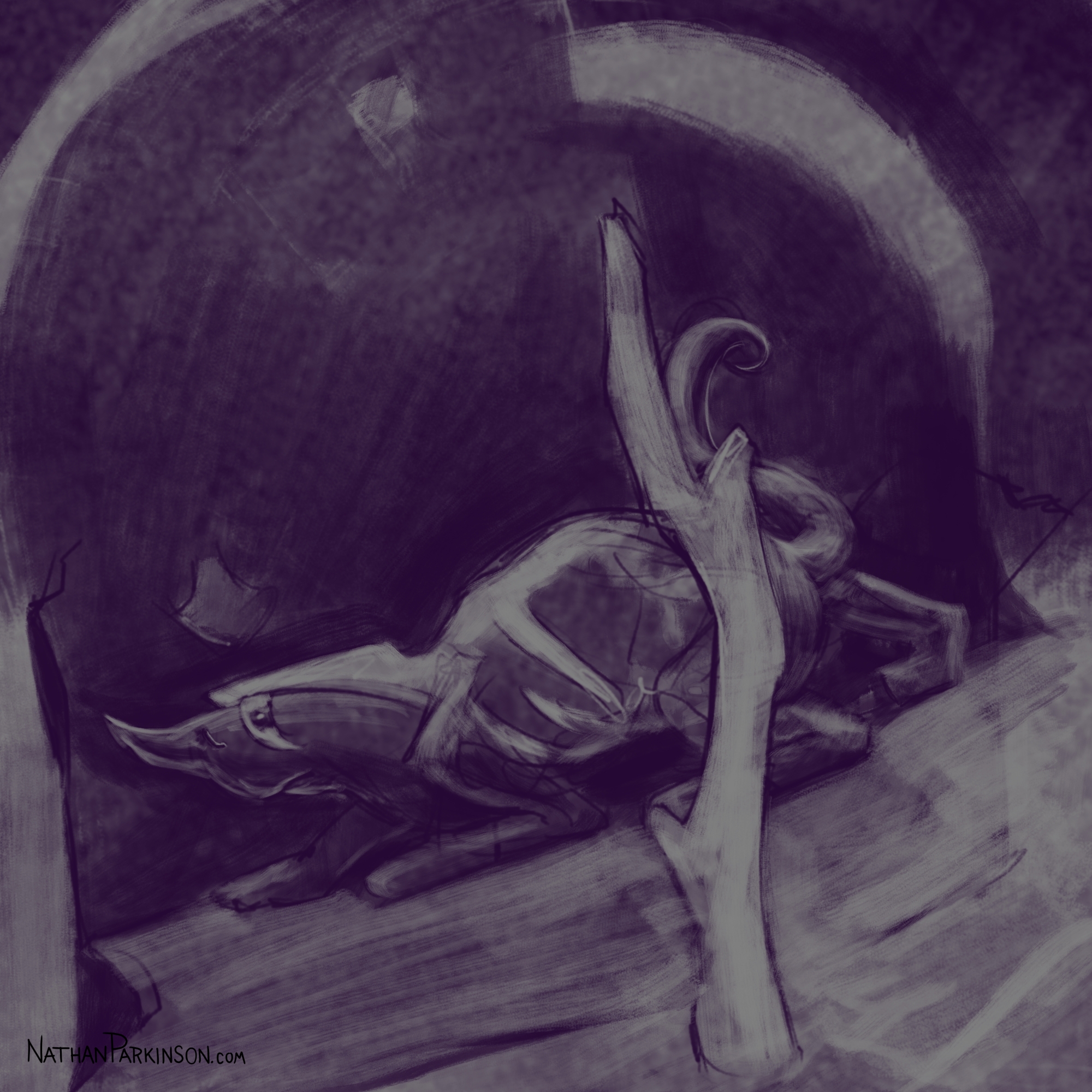
Like the Wind
I tried pushing the level of abstraction in this piece. I like it, but it’s not yet landing where I want to go.


Borrowing a Colour Palette
Having impactful colours in your images can do so much for the interest, even if the quality is rough.
This is a rough illustration I did a while back.

It’s got some fun action, but the colours, contrast, and saturation are weak.
I decided to see how borrowing the colour palette from the following image by Tim McBurnie could improve my image. I paid attention to the saturation and values. I probably just used the colour picker.

This is the result of my application of that palette to the same composition.

I think it gave the impact a massive boost. I also tried to add motion blur and a bit more of a painterly quality. Now the image throbs with intensity! What happens next!?
Here’s a side-by-side comparison of the before and after:
Don’t worry, he’s okay in the end 😉

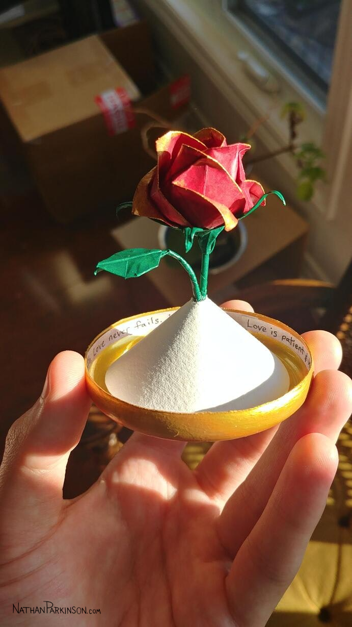
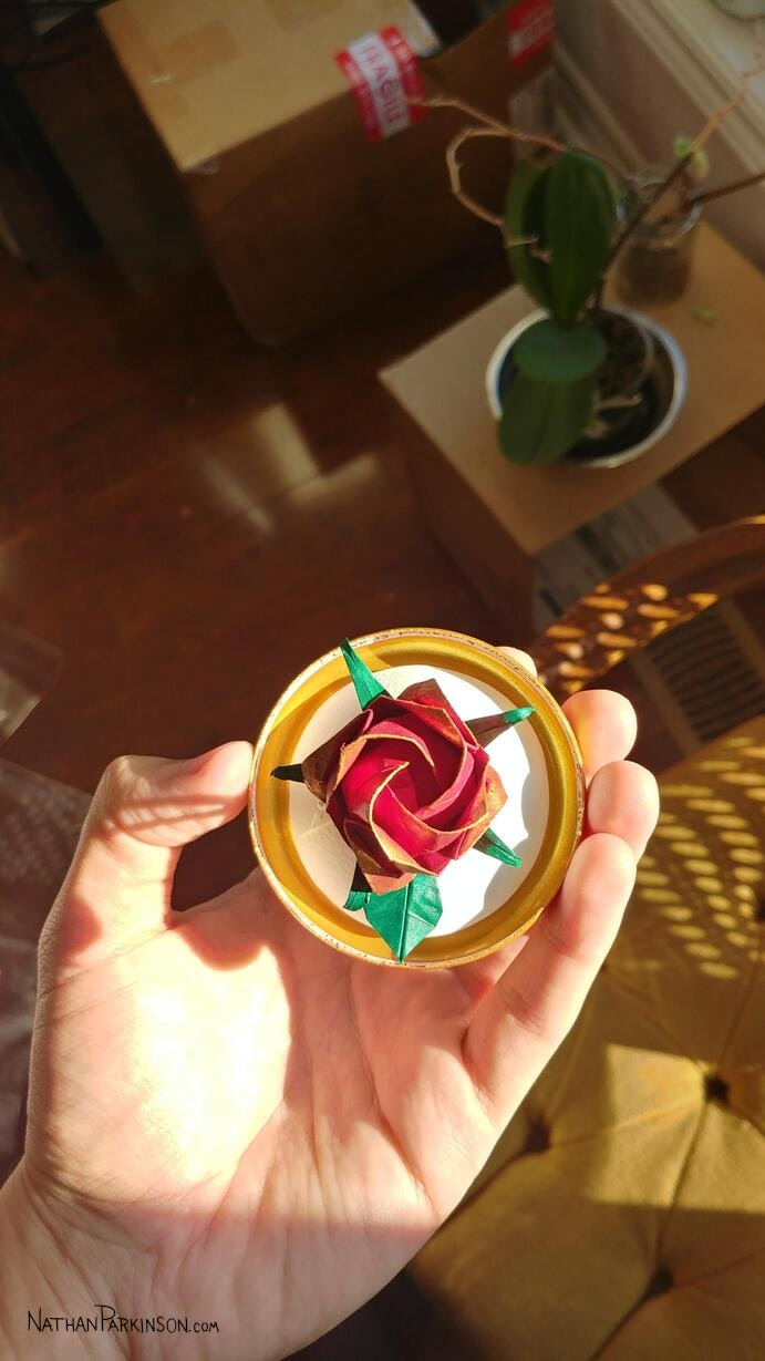
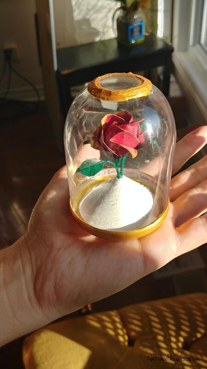
Origami Rose
Last month I dove into origami for a project I wanted to do, some physical art. Dozens of hours learning and tinkering, but I feel the result was worth it. This was my first time really trying origami or gold paint; I really like them both.
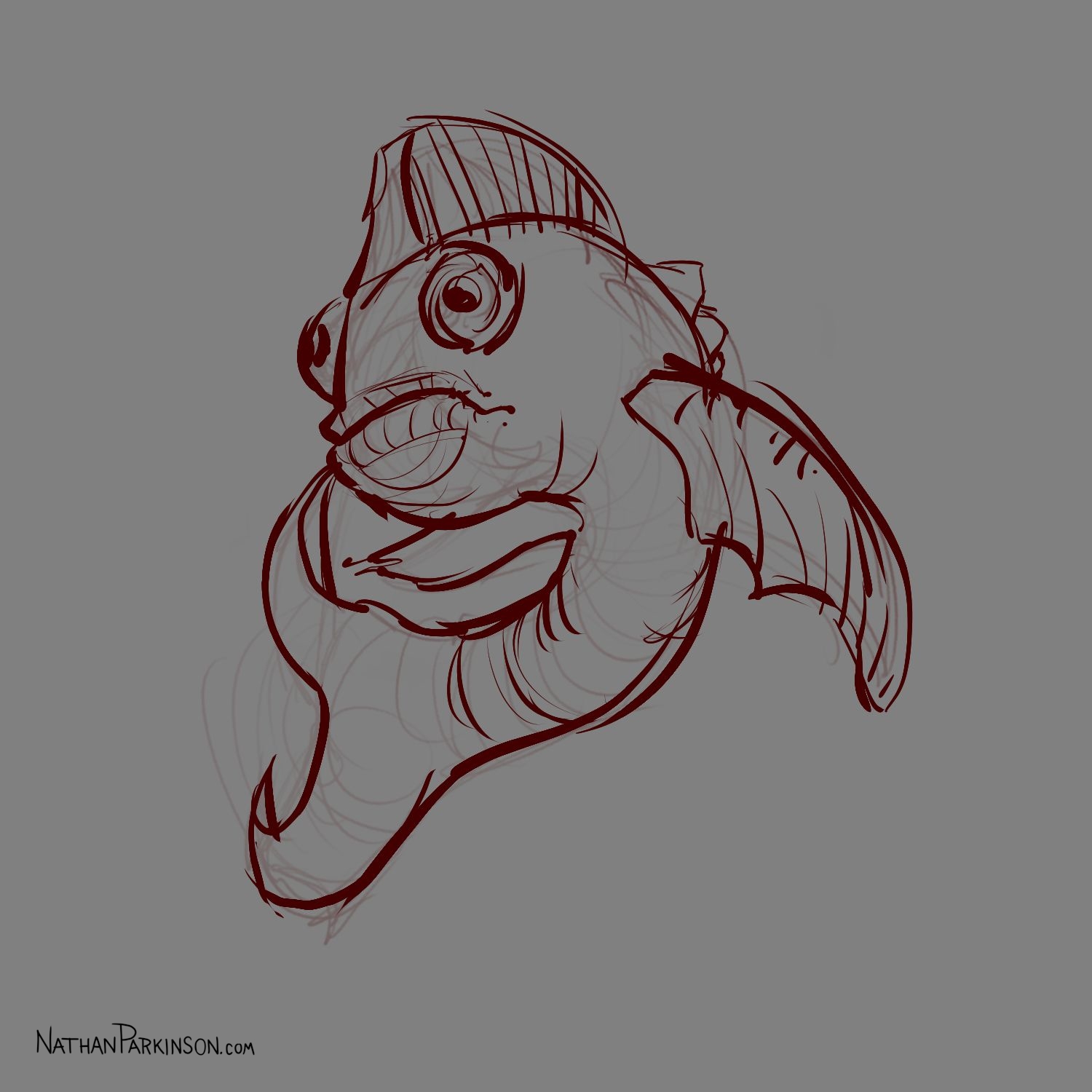
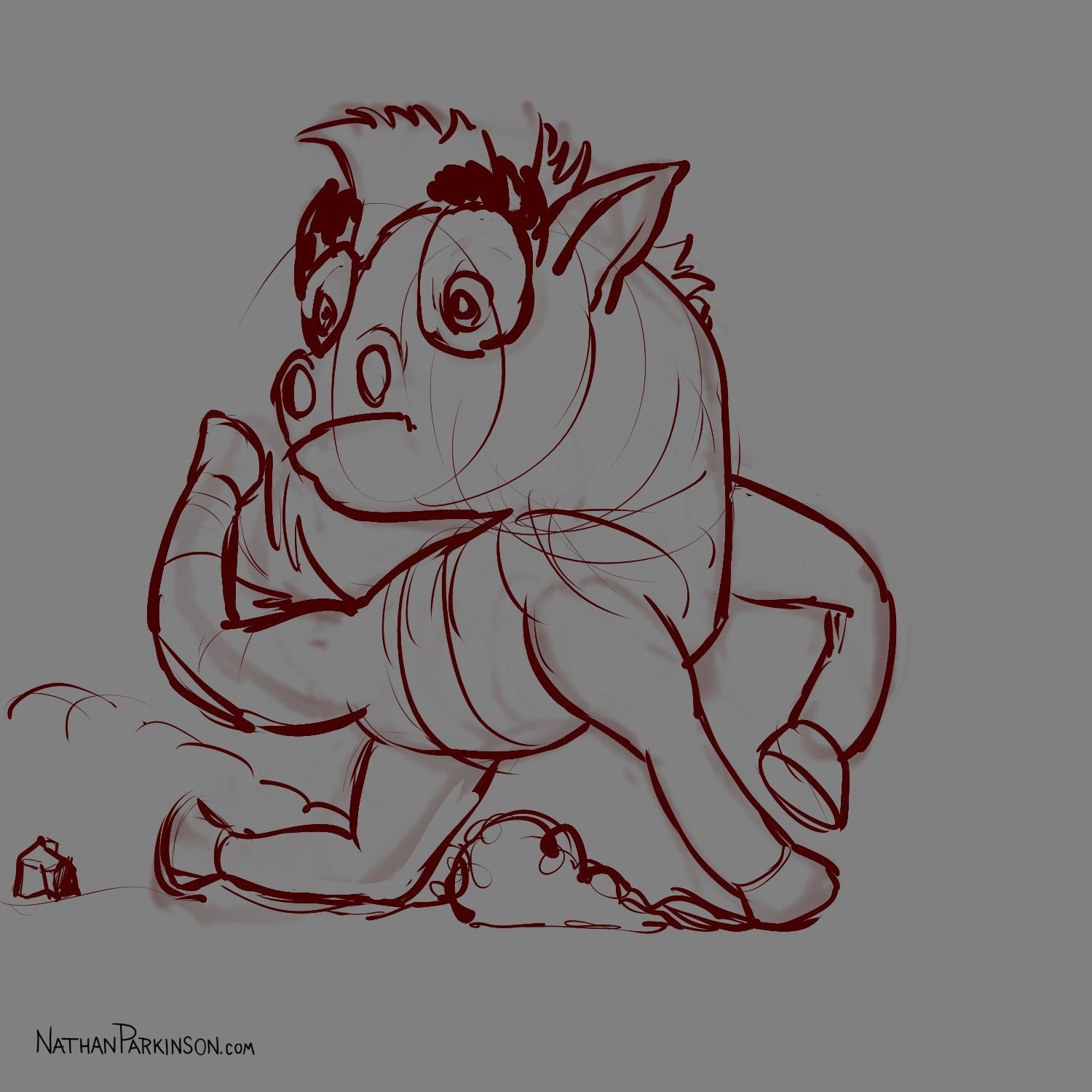
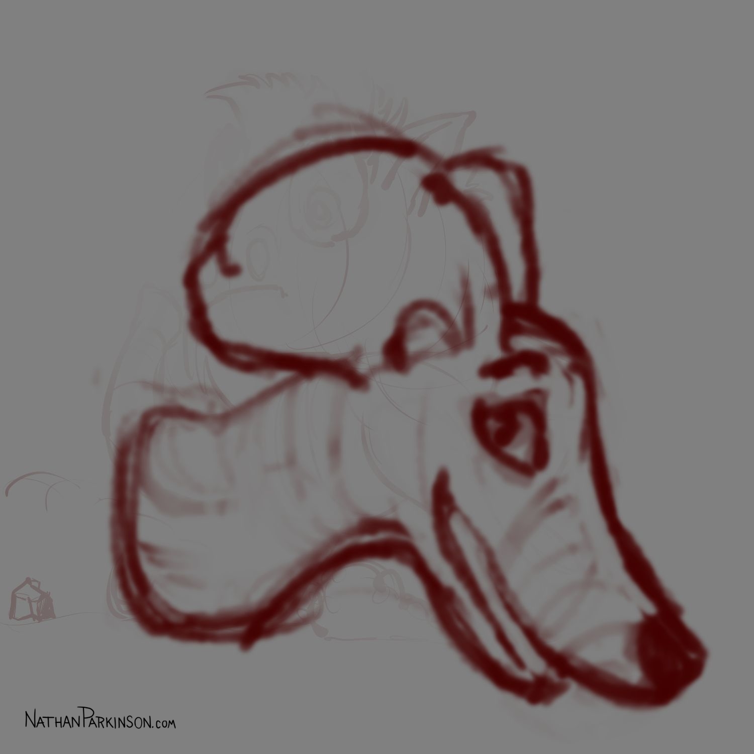
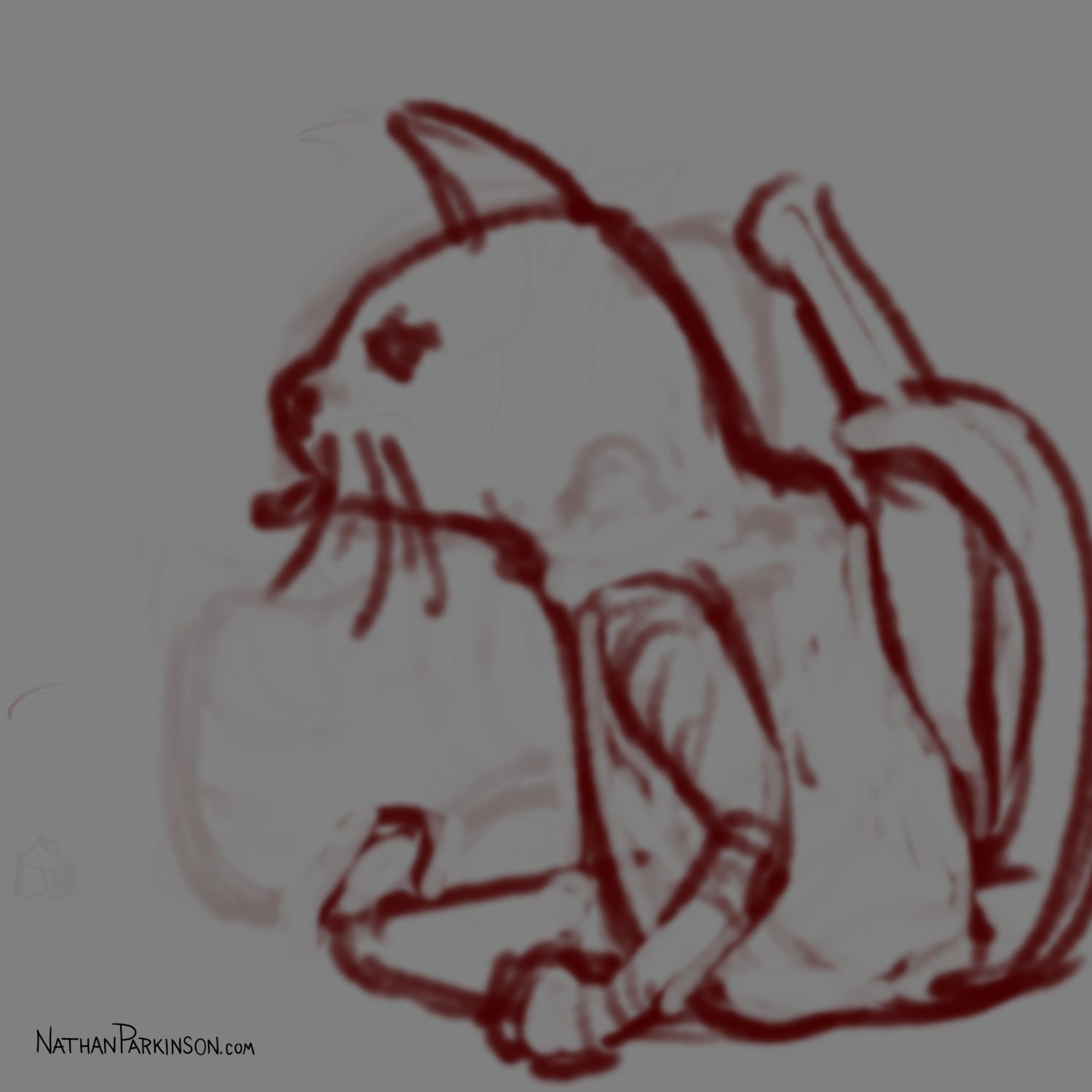
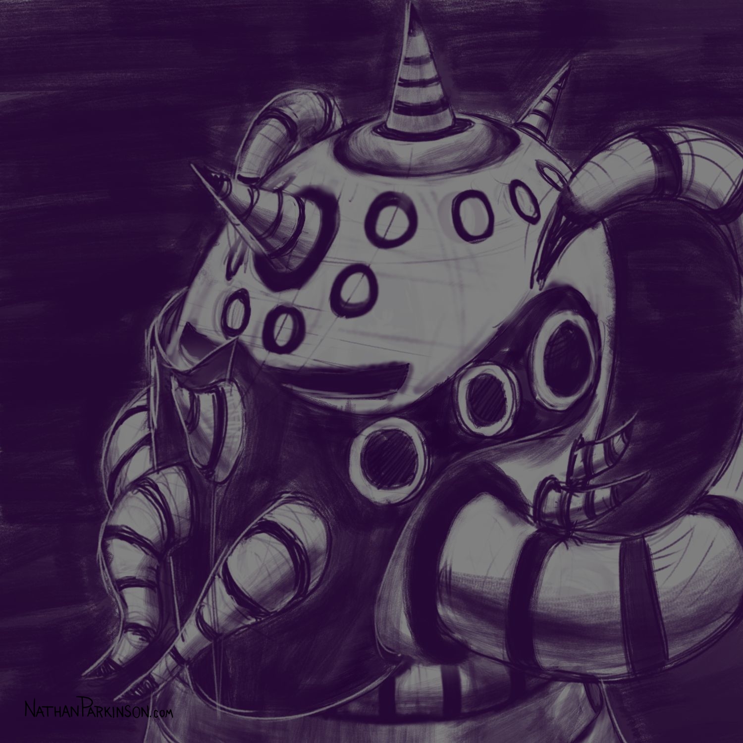
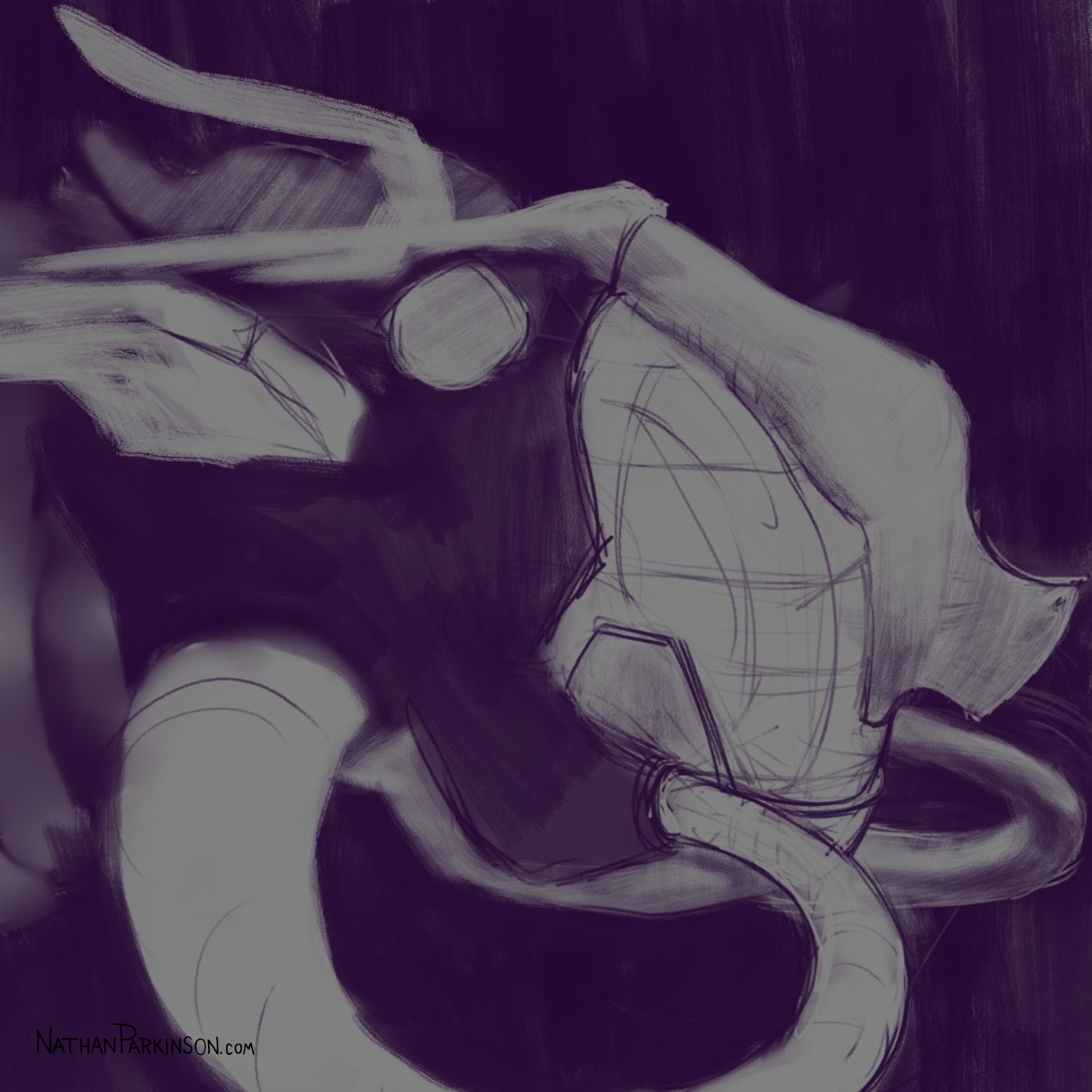
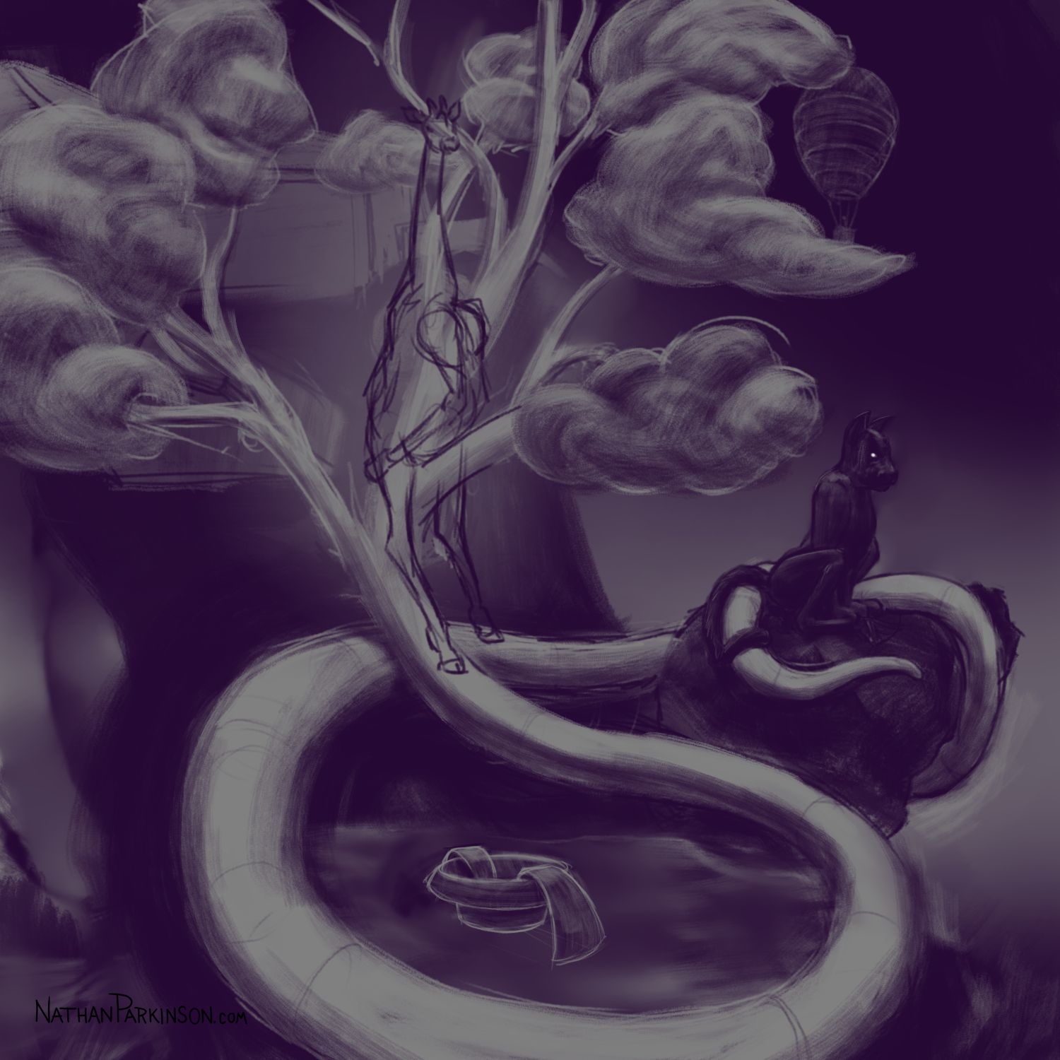
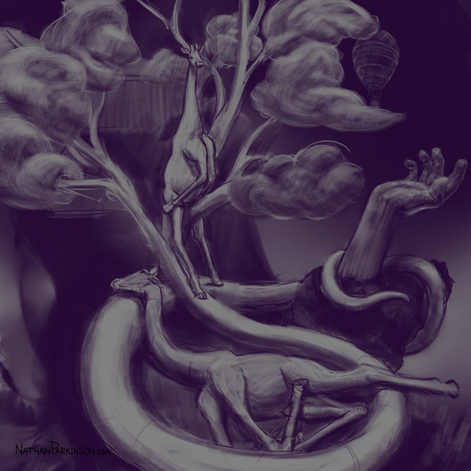
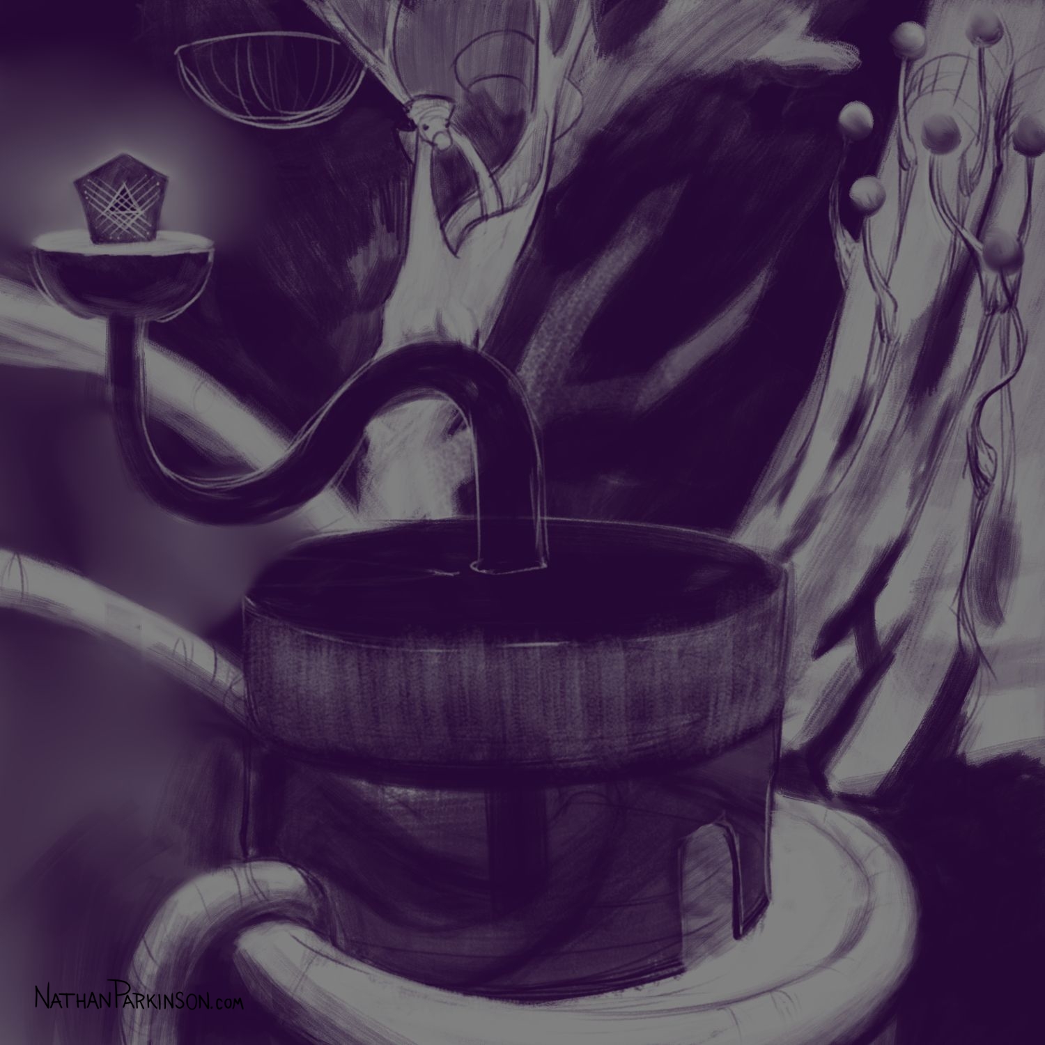
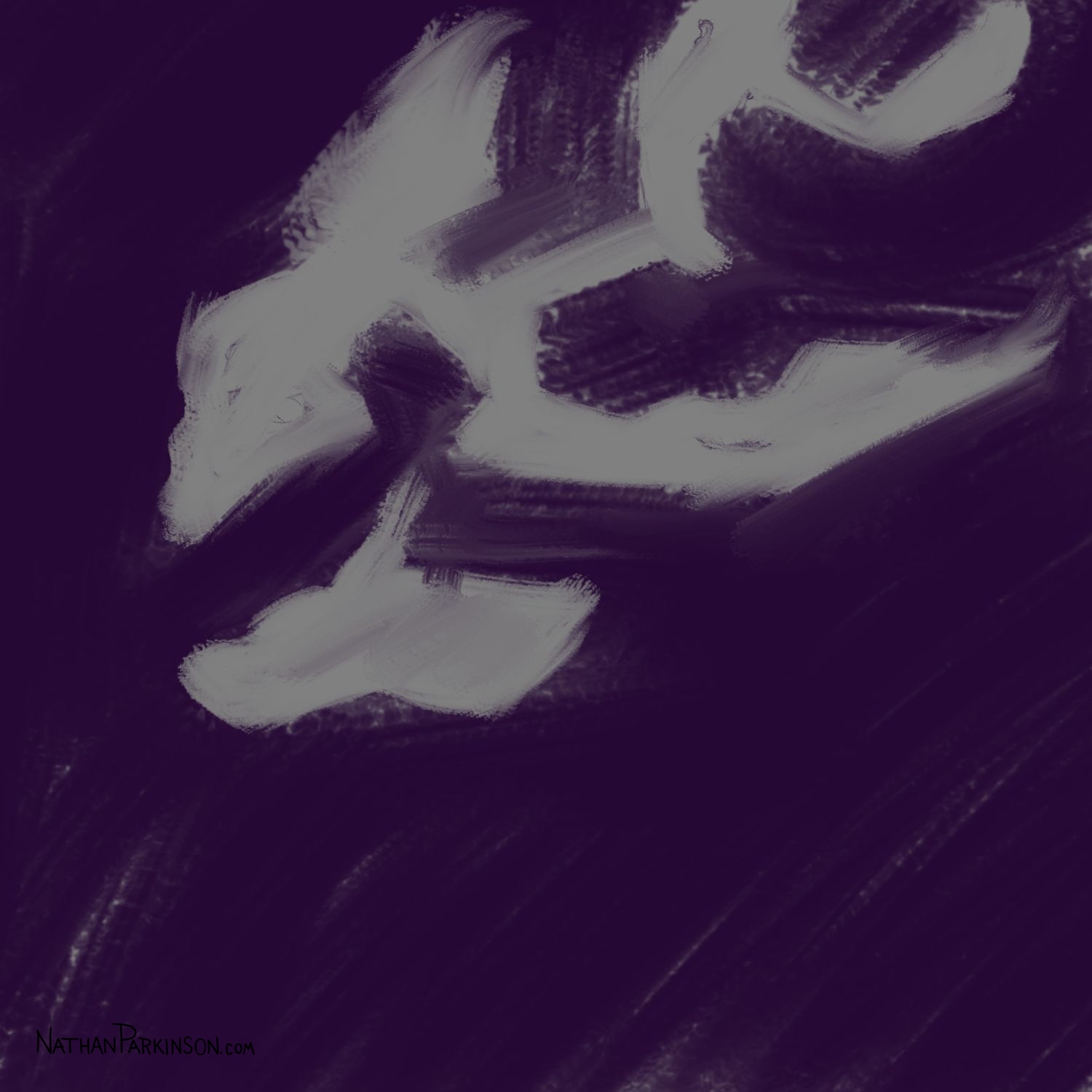
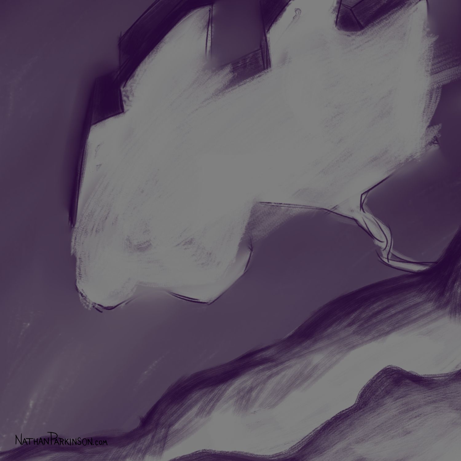
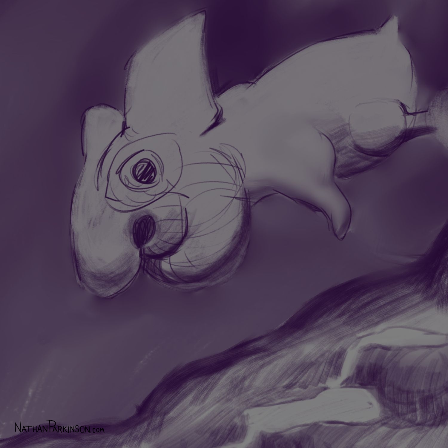
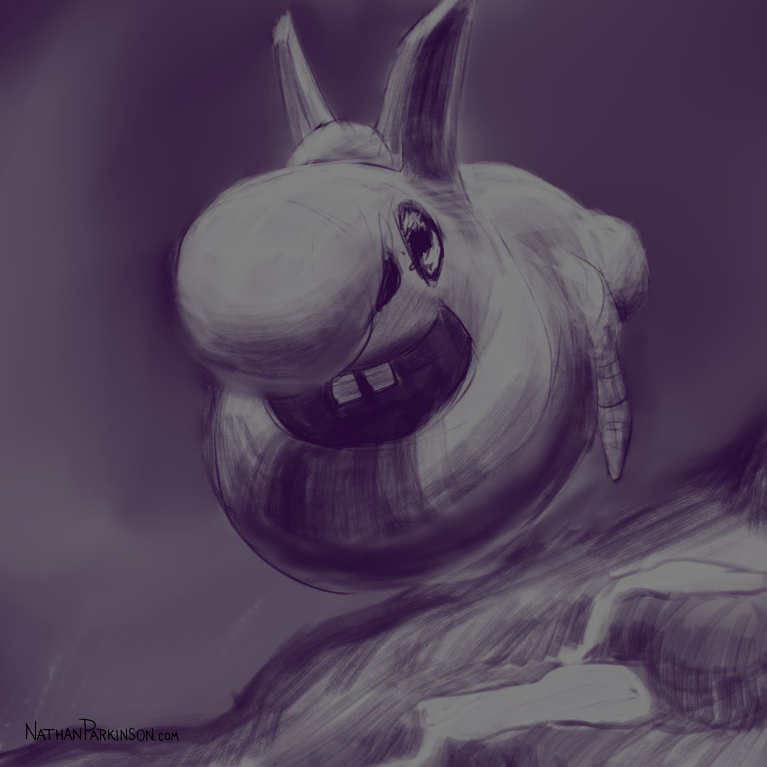
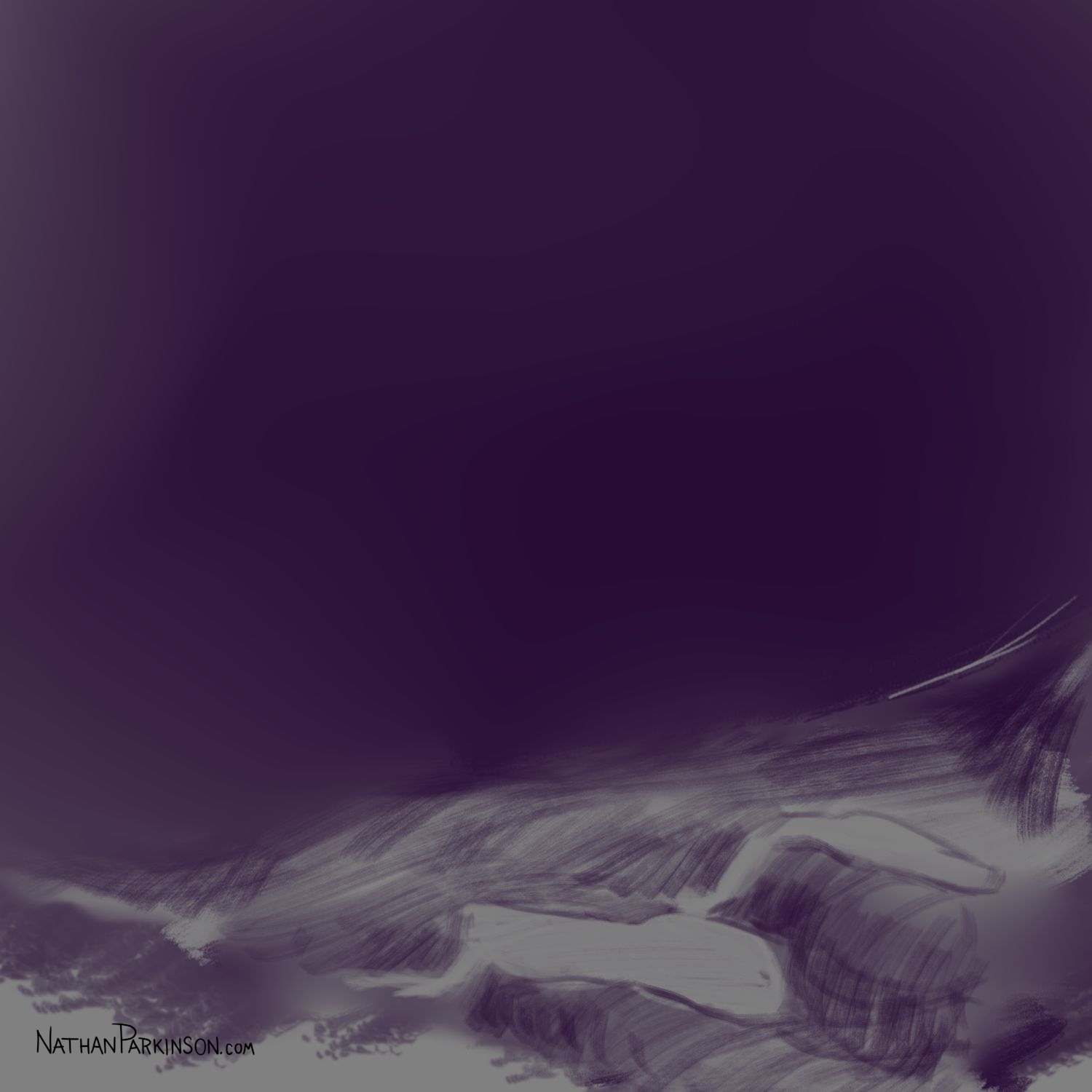
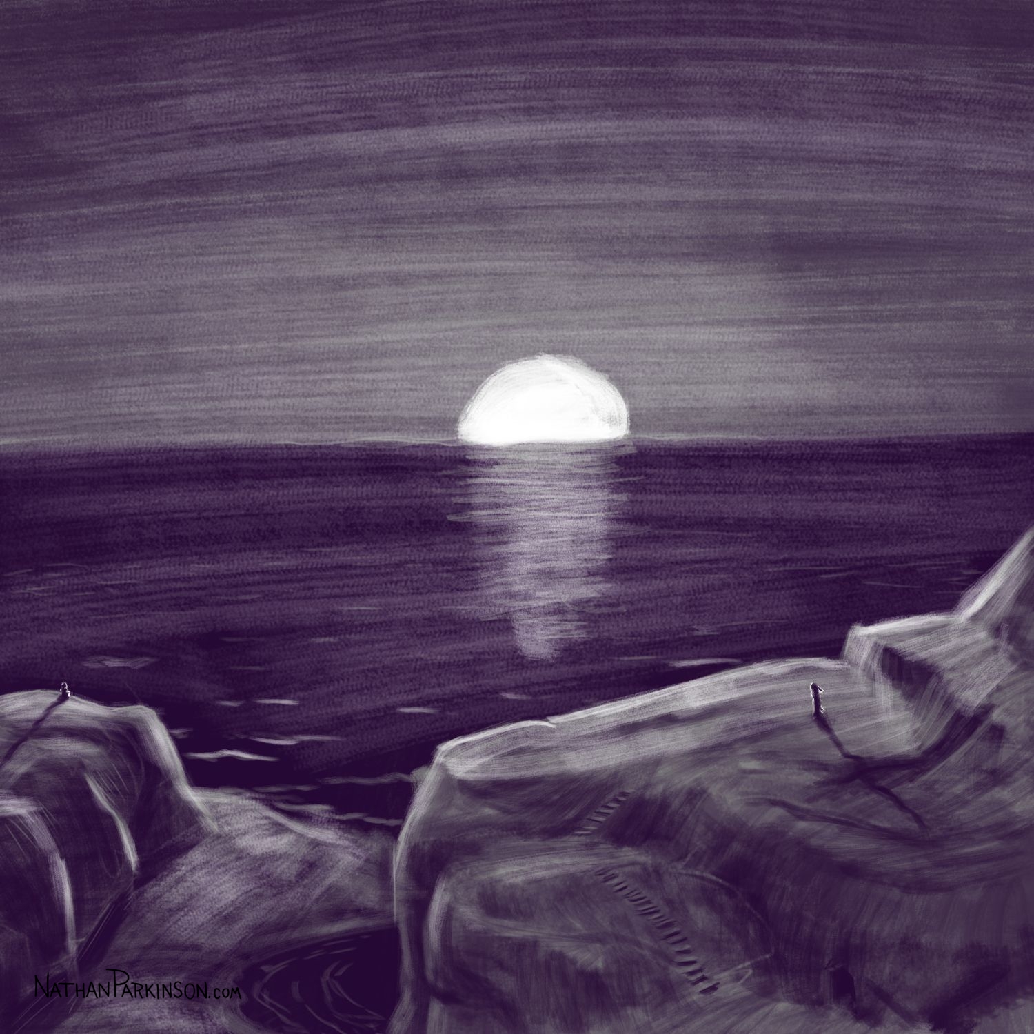
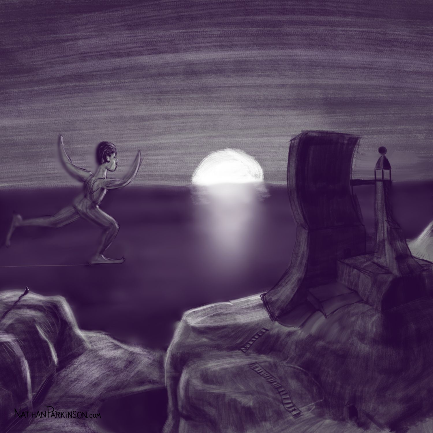
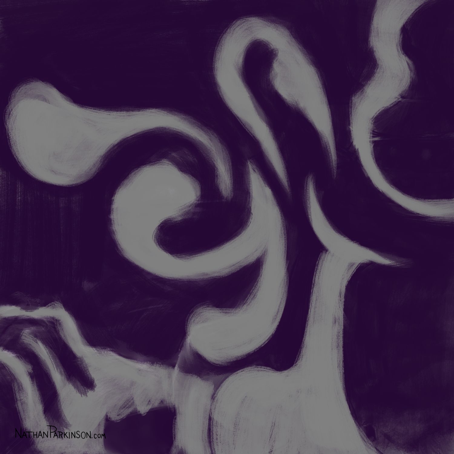
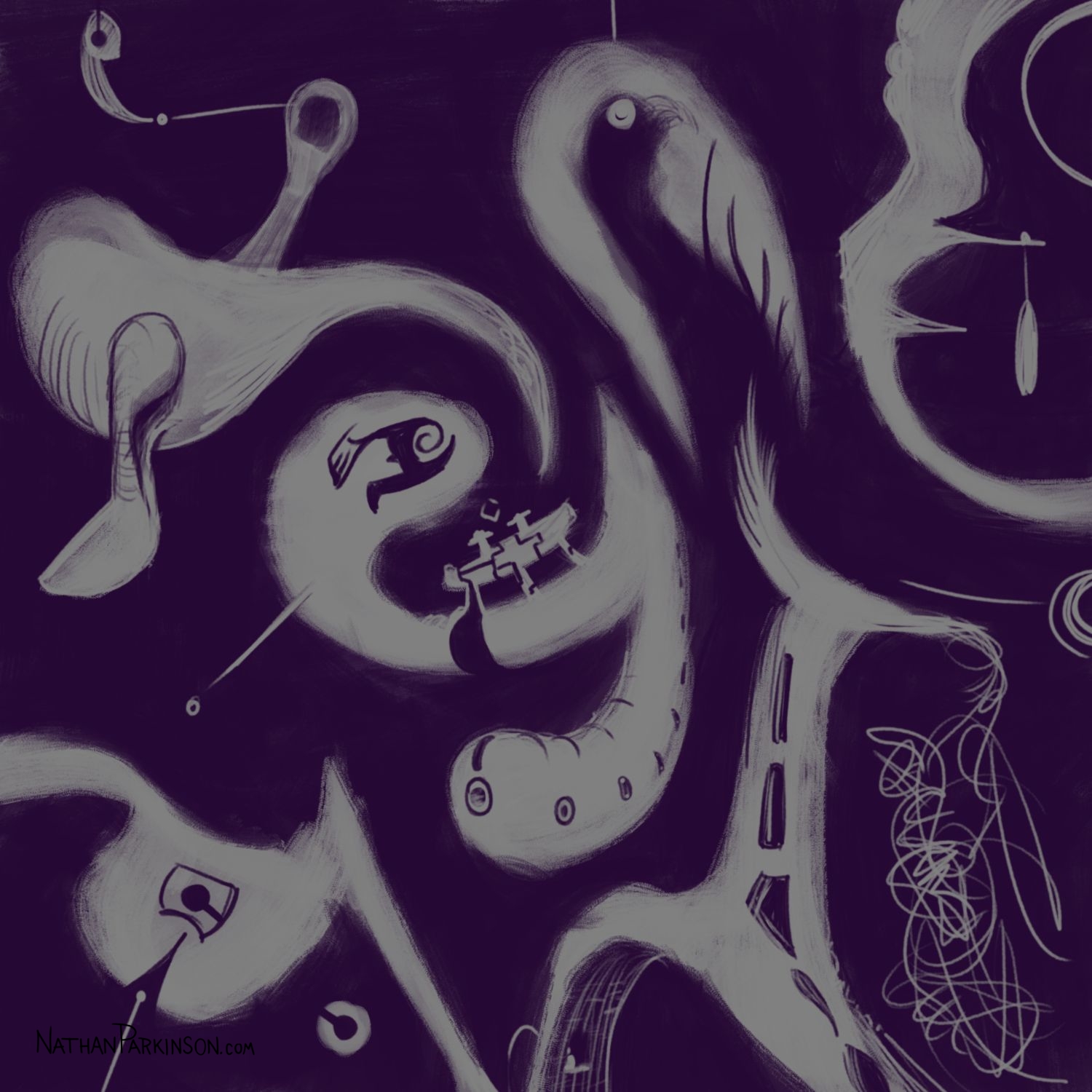
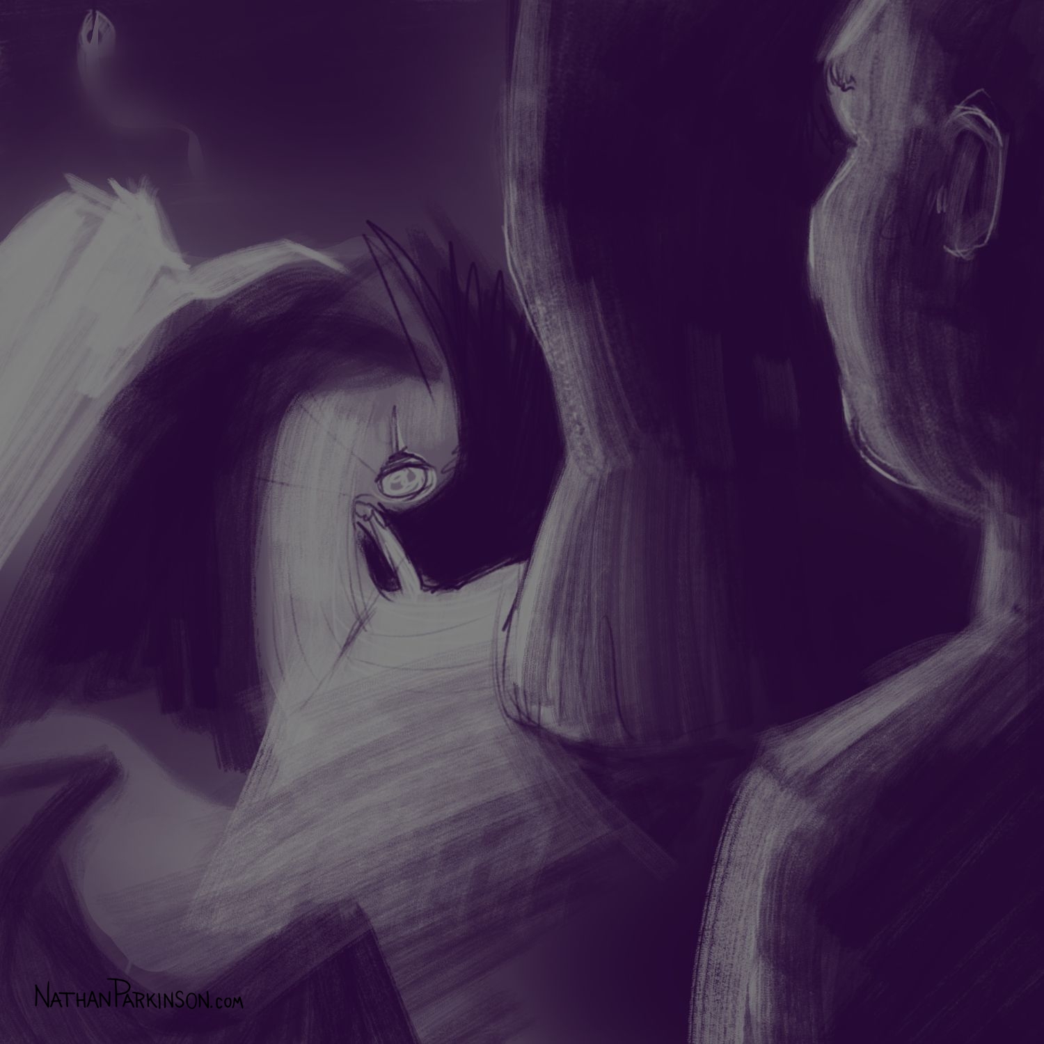
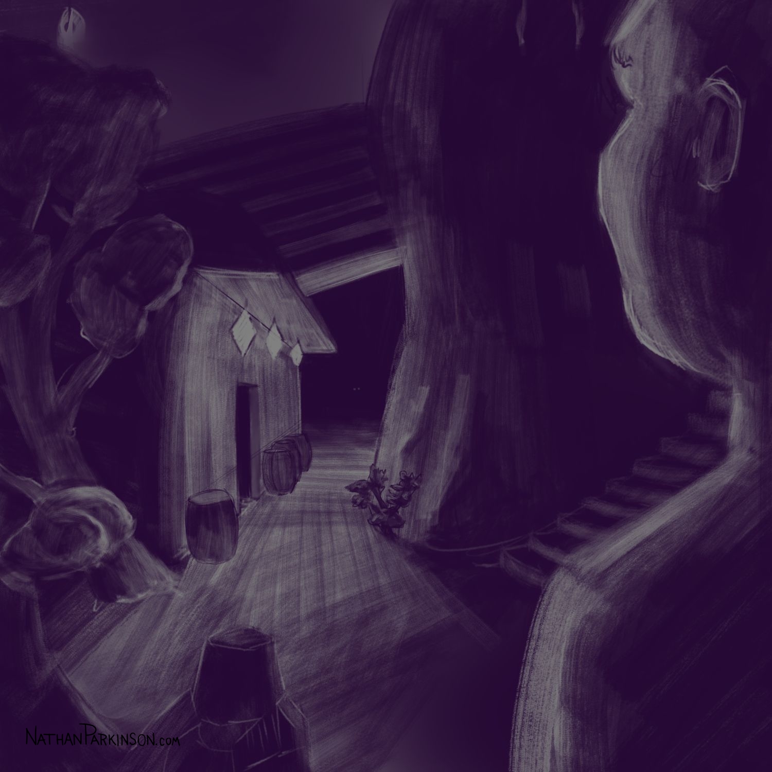
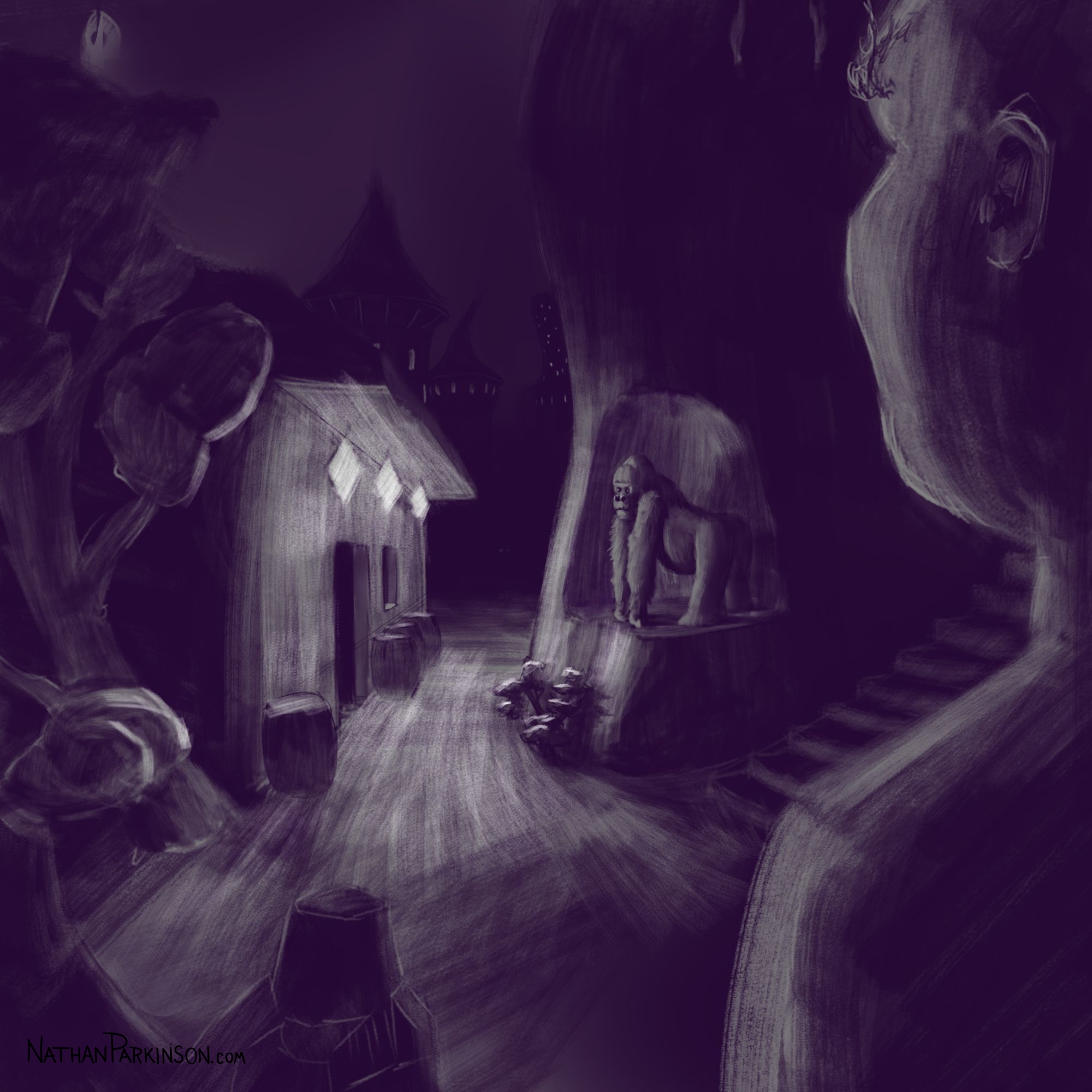
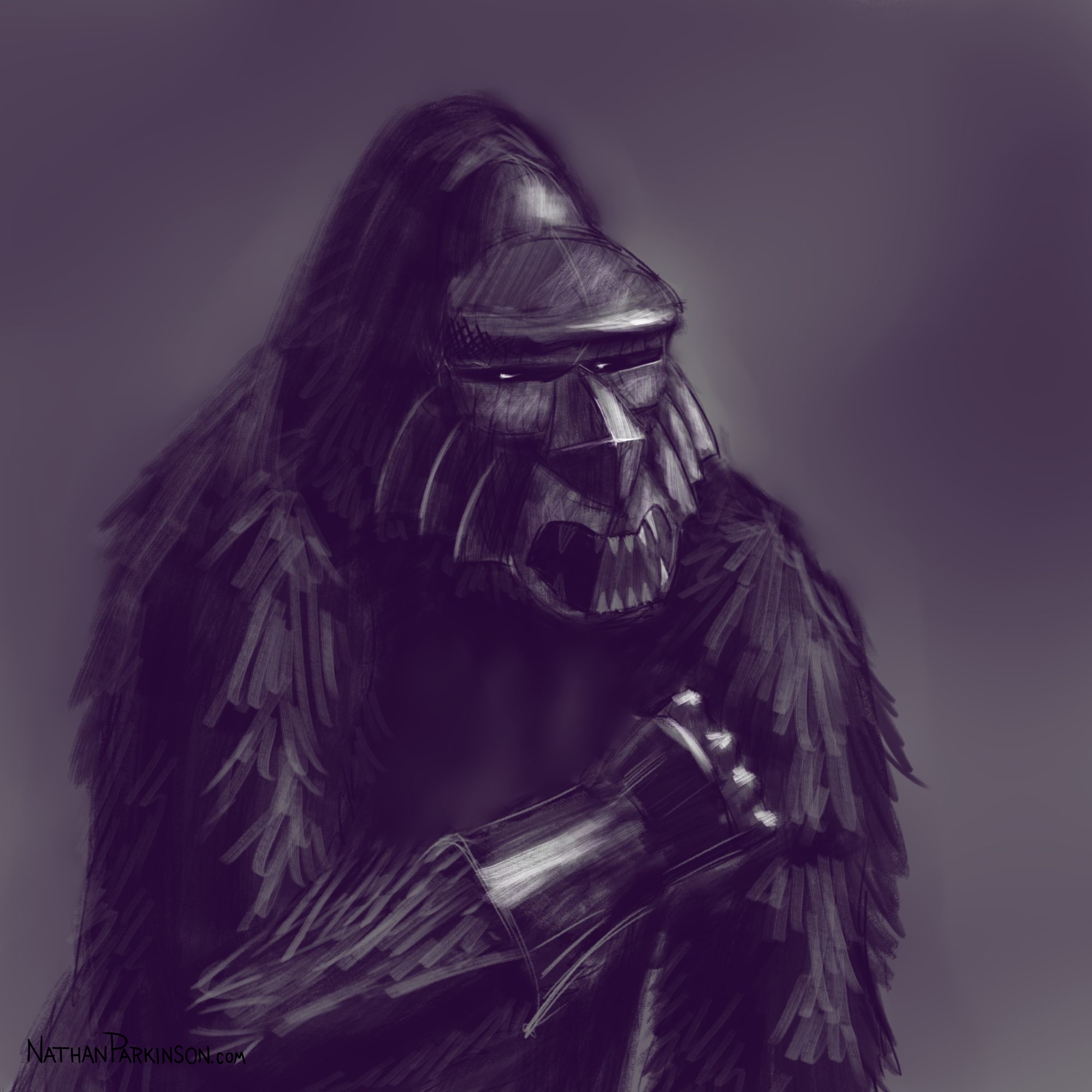
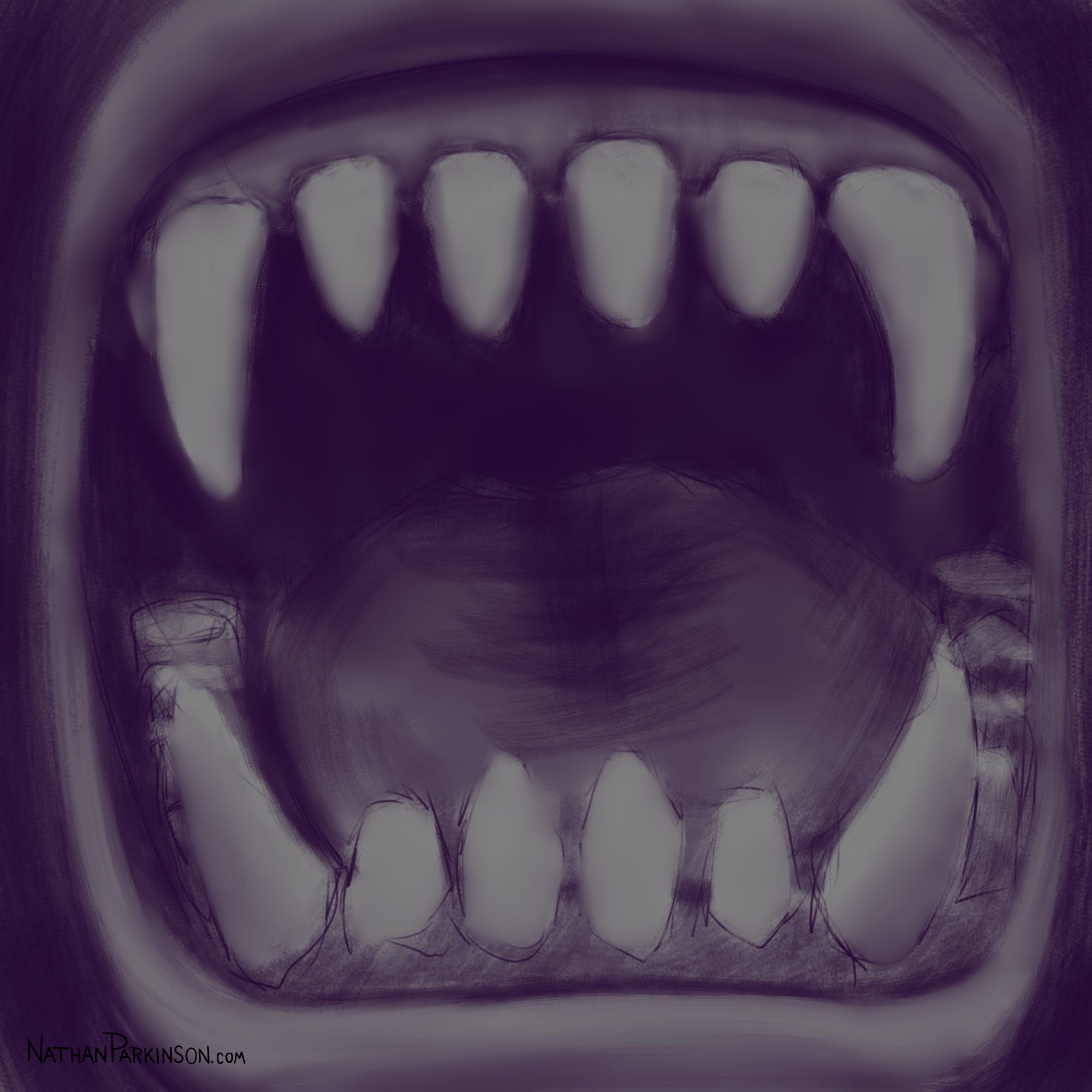
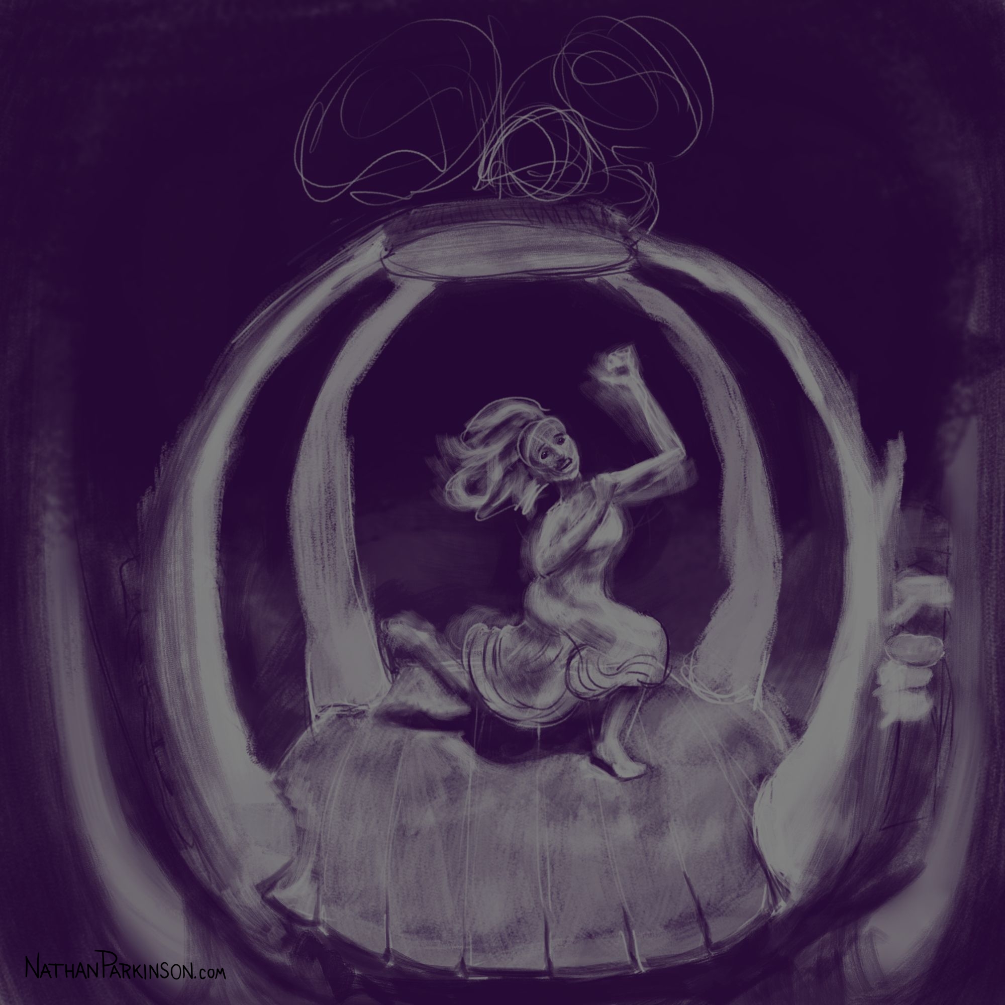
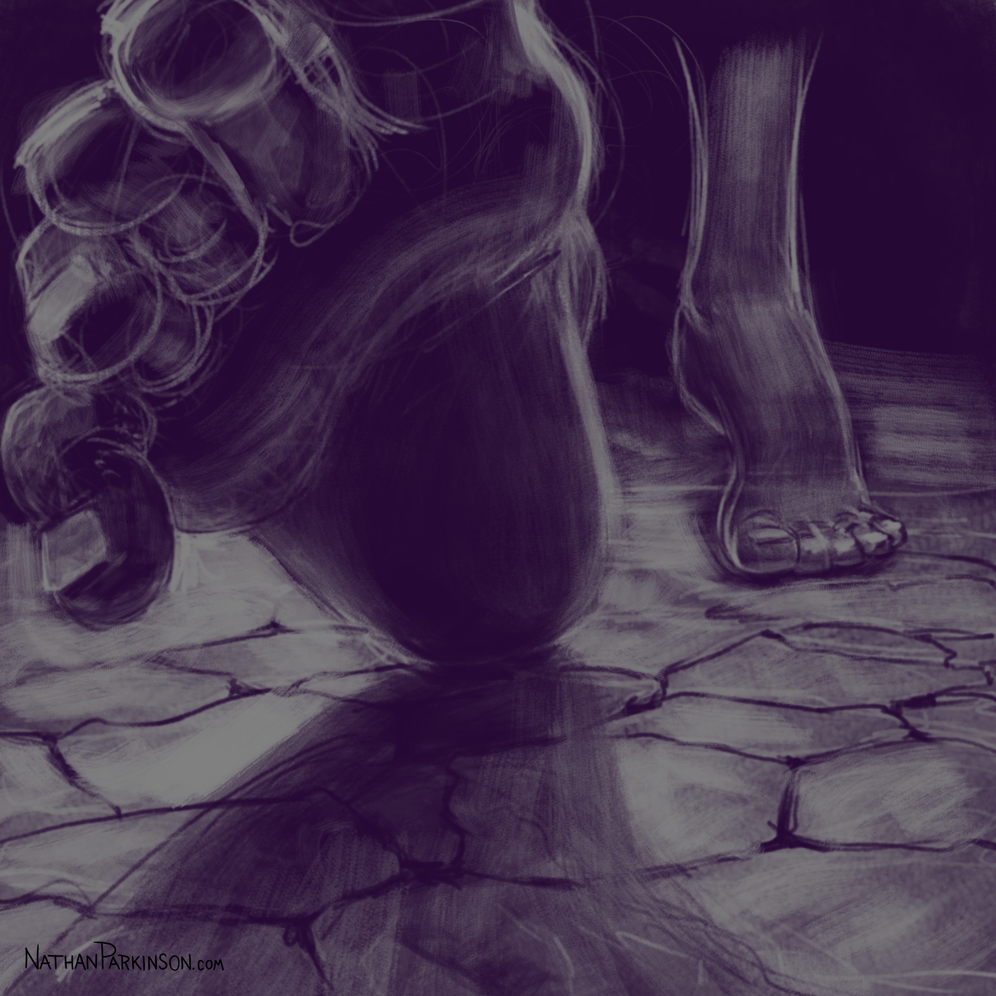
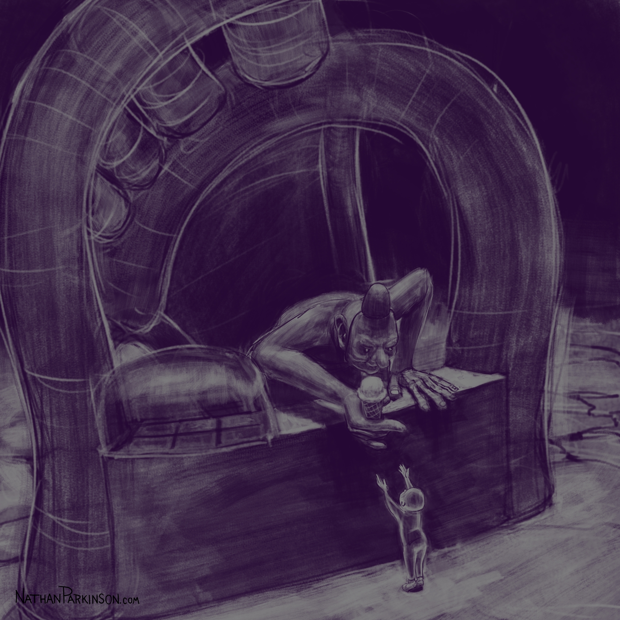
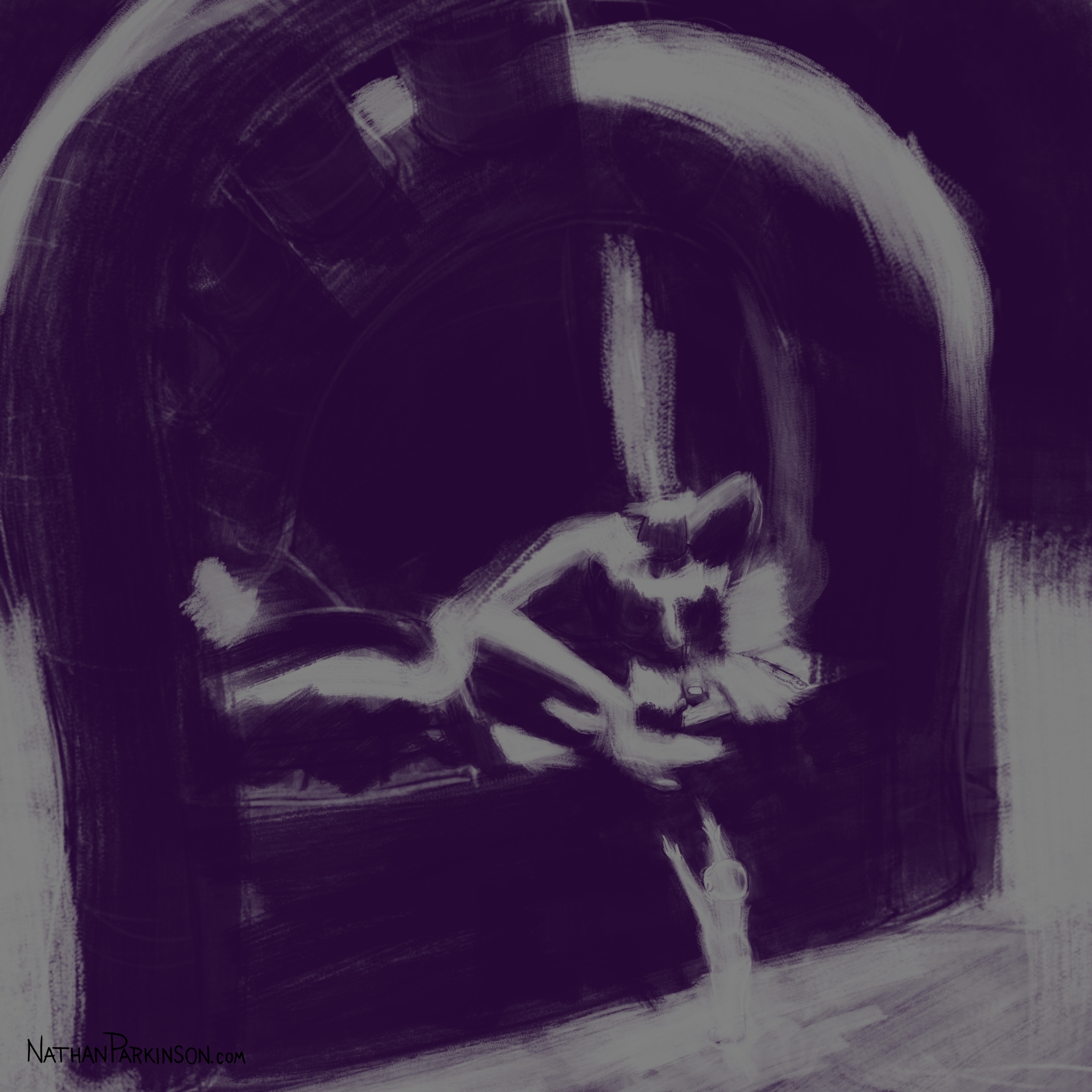
The Morphing Canvas
A little over a year ago I wanted to improve my digital drawing/painting, fight against my perfectionist tendencies, be less precious with my work, and work more efficiently and confidently (I was probably inspired by watching Trent Kaniuga paint).
I created a square canvas with a single active layer on a gray background. I chose a pencil brush for drawing and a paint brush for painting and a single colour (I settled on dark purple). At the start of each day I spent about 30 minutes drawing on this single canvas from memory and imagination. I would take whatever was there from the day before and I would morph it into something else. I eventually began to use some white for highlights and light sources, but I only ever drew on one layer. I drew to get darker and erased to get lighter against that gray background. I came to really enjoy this process and I encourage you to try it. I got some really fun results. I think this is a great way to get back your love for drawing just for the fun of it (if you’ve lost it).
One thing I enjoyed doing was to spend 30 minutes studying some sort of reference, and then another 30 minutes drawing some “morphing art” trying to incorporate what I had just studied into the scene from memory; that was fantastic practice! My digital painting program Krita has a live recording feature which creates a new image with each brush stroke. I would save major points of change to track progress, but a couple times I saved all the images to create a time-lapse video (#MorphingCanvas). Below you will find the bigger milestones of change; there’s too many to include each step. The images are best viewed if you open them in the full-sized lightbox and use the arrow keys to flip through them. Enjoy!
The Morphing Canvas
“Change is the only constant.”
Your Turn
If you do give this a try, I’d love to see what you end up with after a month or two.
New Art Style: Pencil-digital Blend
I am excited to announce a new direction for my artwork. I have a fresh artistic style consisting of hand-drawn pencil on paper with some digital enhancements. It blends the rough, sketchy look of pencil I love so much with the clean visual impact of digital processes.
I have been illustrating my own stories with delightful results, and I look forward to offering this style for commercial projects as well.
If you are interested in having your project illustrated in this style, please reach out to me via email or Upwork. You can see example illustrations in the art collection.

Hand Puppet Master: Barnaby Dixon
Barnaby Dixon develops hand puppets and brings them to life with remarkable dexterity. He is incredibly creative and has a splendid knack for humour (though a bit crude or dark at times) and a lovely blend of skills. See for yourself.
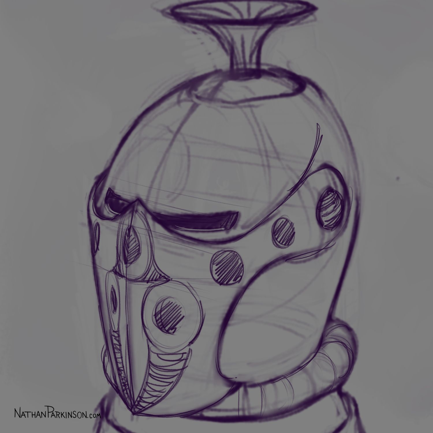
Expanded Product Sketches
I created a couple product/object sketches in an expanded view for a client.


Artwork shown with client’s permission